MountainAide
A Responsive Web App for Mountaineering
Duration
18 weeks
Year
2022
My role
UX Designer, UI Designer
Context
Study Project as part of my UX Design Course
How might a mountaineer follow his passion of alpine mountaineering without risking his life?
-
Mountaineering is getting more and more a popular activity. In particular Alpine Mountaineering and Via Ferratas are risky sports. The statistics show clearly, that 75% of all major accidents happen to beginners. To name the most frequent reasons:
Risk underestimation, misjudgement of the natural forces, lack of necessary knowledge of the state of the art mountaineering and local circumstances, how to deal with an emergency, wrong or incomplete equipment, poor preparation and others. -
Mountaineers need a way to [ask mountaineering experts for advice], because [they need to know the risks of their individual mountaineering trip and how they can get prepared to stay safe.] We will know this to be true when we see [that the app will gain each year new users.]
-
We believe that by [creating an expert app] for [mountaineers],
we will achieve [that we open up a new market].
We believe that by [offering online expert mountainguide counsellings] for [mountaineers],
we will achieve [that we built up a viable market place business model]. -
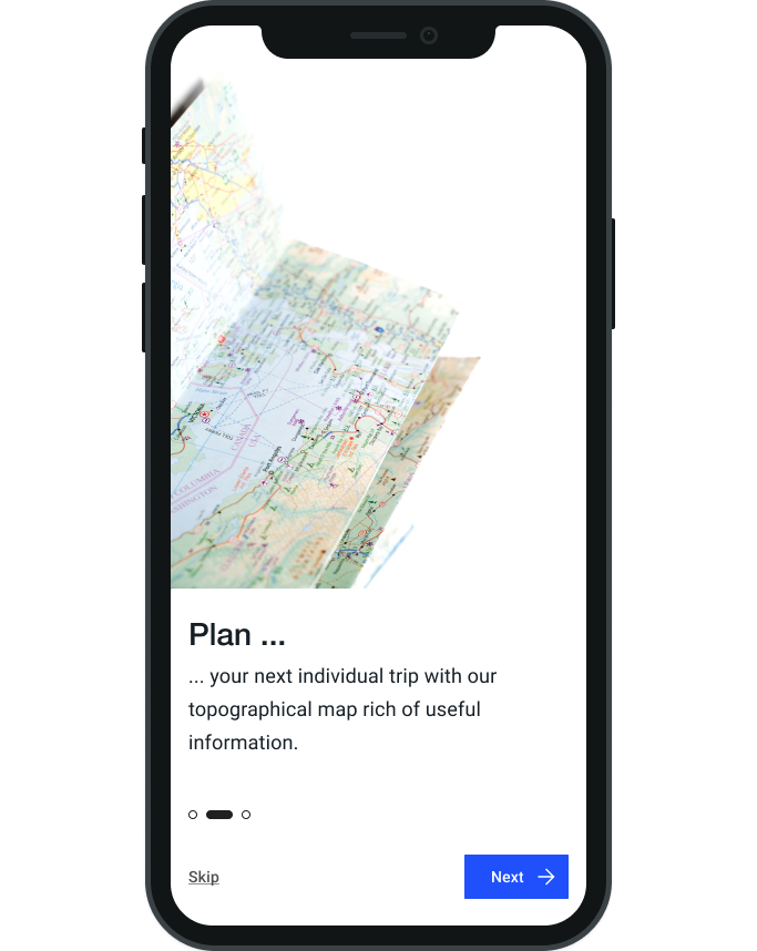
Developing a responsive web app that allows mountaineers to ask an expert for advice. This service will be billed. Additional the app provides users inspiring content to explore, like mountaineering field stories, essential know-how or events. The app offers an interactive topographical map for trip planning, an organizer to store all information related to a trip planning and a platform to connect with like-minded people. Most content will be for free, but parts will be accessible only with a premium membership.
Keyfeature - Explore
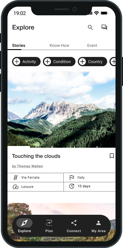
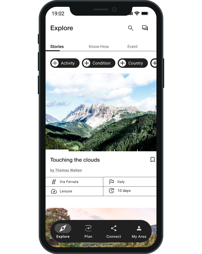
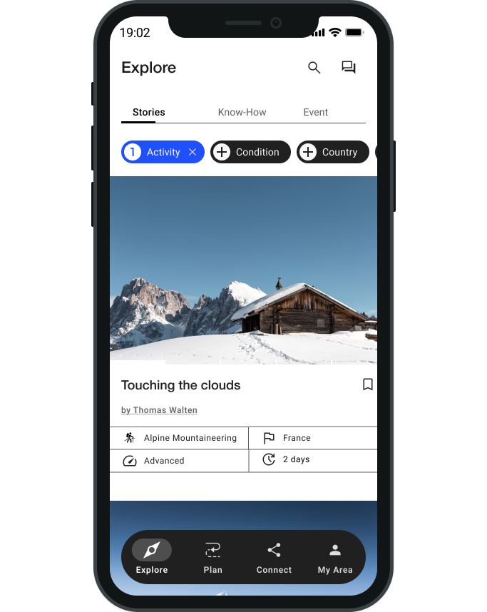
Mountaineers need inspiration. For active people there nothing more inspiring than field reports from like-minded people. In Addition, mountaineers need essential know-how reports, about all safety and gear topics, in order to update their knowledge to recent state of the art. They can learn new skills and learn new techniques also during real life events with like-minded people. If this will be workshops, training camps or festivals.
Keyfeature - Connect
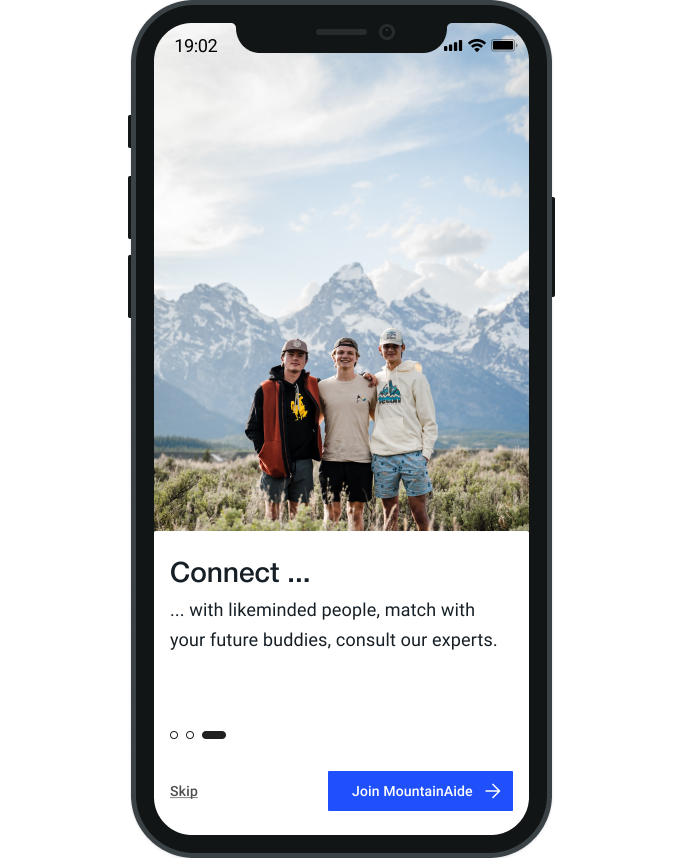
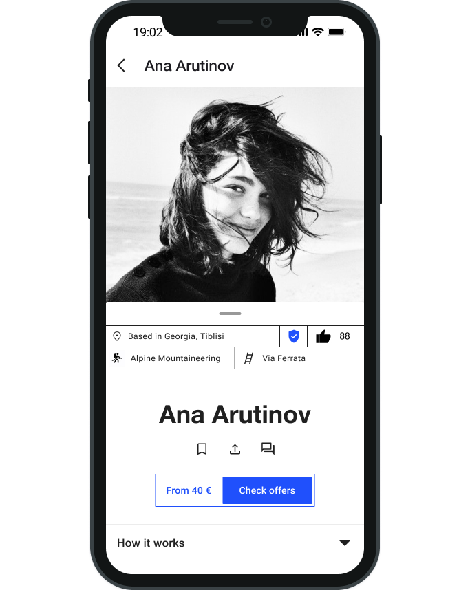
MountainAide is more than just a service, it is a platform of the mountaineering community. There doesn´t exist anything like this on the market. With MountainAide mountaineers will be able to connect with likeminded people, match with their future buddies, or they may consult one or the mountain experts.
Keyfeature - My Area
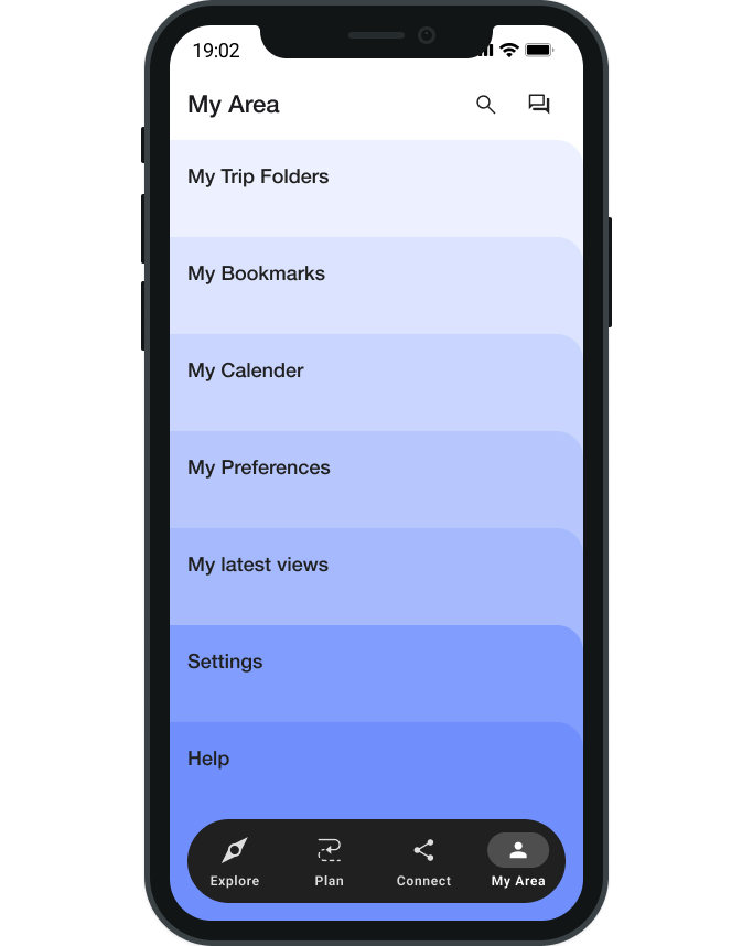
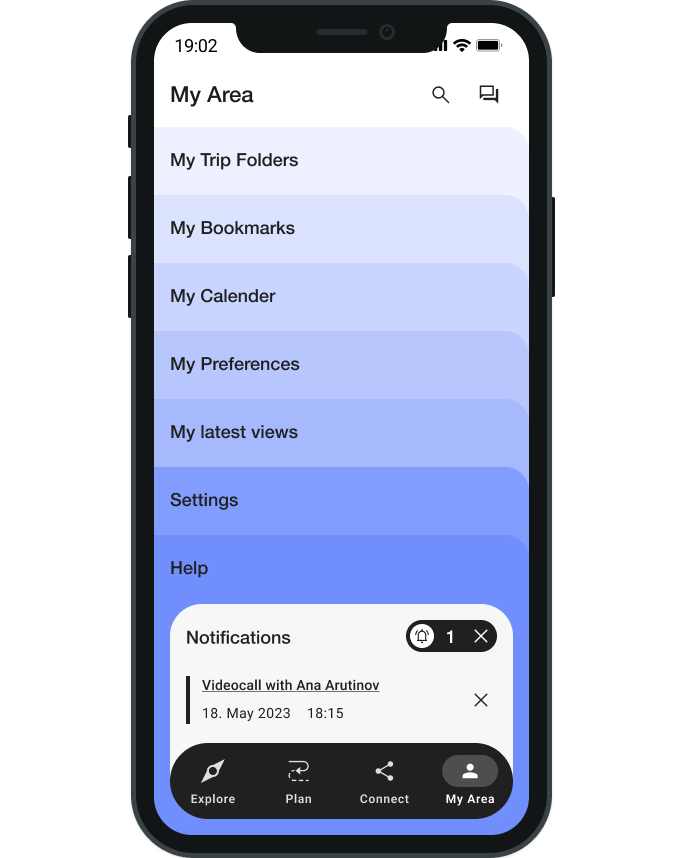
MountainAide has an organizing feature. Collected content can be saved and organized. Everything is stored in one place and will be accessible for all trip members. Sharing content will be simplified. Also the communication, with discussions and feedbacks will be clear and traceable. Preparing a trip is a complex undertaking. And MountainAide will provide a suiteable supportive structure.






Approach
-
Discover.
Competitive Research
SWOT Analysis
UX Analysis
User Stories
Online Surveys (Quantitative User Research)
User Interviews (Qualitative User Research) -
Concept.
Proto Persona
User Journey Map
Task Analysis
User Flow
Content Auditing
Information Architecture
Sitemap -
Iterate.
Low - High Fidelity Wireframes
Usability Testing
A/B Preference Testing -
Deliver.
Style Guide
Design Language System
Discover Phase

HOW DOES THE MARKET TICK?
HOW CAN MOUNTAINAIDE STAND OUT?
Competitive Research
-
Creating an informative analysis and getting to know the competitors in the market.
Assessing how competitors design for their users.
Finding opportunities to stand out in the existing market and creating sustainable competitive advantages.
Getting to know the expectations and claims from potential users, by getting to know the key competitors in the market.
-
With no benchmark identified, I analyzed to the topic related apps regarding their functionalities, in order to identify the best practices:
OutdoorActive is an outdoor app to find, plan, record, navigate and share tracks and experiences. This app misses so far any expert feature.
Clay is the first mental health training club and offers personalized plans, a community for mental matters and 1:1 Live Coachings.
Process & Methods
-
Competitor Profile.
To get an overview I analyzed the goals, strategy, market advantage and marketing profile.
-
SWOT Analysis.
To find advantages, I identified strenghts, weaknesses, opportunities and threats.
-
UX Analysis.
To make my design better I analyzed the weaknesses in the UX of competitive apps.
Key Findings from Competitive Research
-
It is market niche. There´s no comparable product on the market. Other outdoor apps offer planning tools and some general information, but no customized councellings.
There are many mountaineers living in the specific areas, with a high knowledge, but without a channel to communicate their knowledge.
-
Other outdoor apps have a big advantage in the area of mapmaking and planning tools.
Another risk might be the legal foundation.
-
Intuitive and simple navigation with a clear structure.
Organize content according the interest of the user.
Motivating, casual and personal wording.
Appealing UI
Self-descriptive content – supportive information is provided proactively.
Transparent communication gives a feeling of trust.
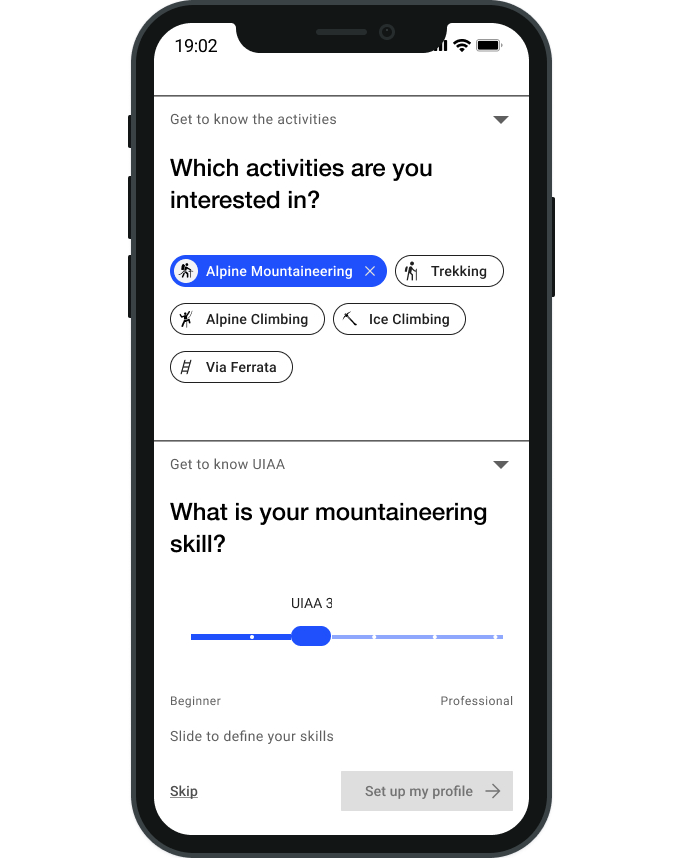
Costumized content by user profile set-up
-
The quality of our content and experts is a key factor to increase the number of users.
A journal offers highly inspiring user reports from the MountainAide community. Each member has the prospective to get published and to speak to a broad audience. This will foster the community feeling. A high costumer retention rate is expected.
Inspiration and a basic planning tool is accessible for free.
Each expert booking will be charged and will be the main income.
A premium membership, billed annually, offers premium services e.g. more storage space, extra features like sharing real-time data, direct booking services for alpine cabins, among others.
Conclusion
Yeah! Market research revealed, that MountainAide might be a viable product. Even though there are related products on the market, none is offering a marketplace app for mountaineering. MountainAide will be unique with its idea of digital expert counseling.
Essential Requirements
User Stories
After having roughly sketched out a product idea in my initial BRD. It is now the time to formulate the product idea more holistically. To recognize possibly forgotten aspects and functionalities early on, it is important to describe the product from many different user perspectives. User Stories or Job Stories are the perfect framework to do so. (Unfortunately, due to time constraints, I was focusing on only one user group.)
User Stories help in various development stages of the product. Properly written user stories provide a solid basis for communication and collaboration for both the product team and external stakeholders. Due to the non-technical language, they foster effective collaboration. Everyone can participate in shaping the product by defining, challenging, or prioritizing user stories.

THE BEST WAY TO THINK & DESIGN USER CENTERED IS TO ASK THE USERS DIRECTLY.
User Research
-
Understand users´s behaviour.
Learn about their habits, needs, goals, pain points and motivations
Collecting data about their context
Process & Methods
-
User Survey.
Quantitative Data: Online questionnaire with 8 questions to gain quantitative data and get initial insights from the users.Foundation for the Interview Questionnaire.
-
User Interviews.
Qualitative Data: 3 remote interviews with mountaineers, via Zoom (45 min) each.
Preparing an interview script with neutral questions based on the survey outcome. Listen to the user´s needs. Deepening topics by following up questions. -
User Interview Analysis.
Analyzing Method, in order to find patterns, connections within the gained data. A way of organizing the research findings from both: surveys and interviews. Deriving insights out of complex data.
Key Insights from User Research
Concept Phase

HOW CAN ABSTRACT DATA BE CONVERTED INTO ACTIONS?
Point of View
-
Converting abstract user research data into tangible and more memorable data, which is more easily to use during the product development.
Generating a solid point of view, a north star for the product development -
Including all kind of motivations for mountaineering. From leisure seeking people up to ambitious people with an adventurous mind-set. Ella and Fynn represent these two opposing mental models.
Process & Methods
-
User Persona.
Focusing on the users needs, by establishing empathy with the users.
Prioritize the app´s functionality.
Simplify conversion throughout the design process within the team and external stakeholders.
-
User Journey Map.
A way to present motivations and behaviors.
A way of visualizing the journey, a user takes in order to accomplish his goal.
User Journeys are a perfect tool to dive into the users point of view, uncover new insights – which make the product more complex and step by step more realistic.

HOW WILL USERS ACCOMPLISH THEIR GOALS WITH THE PRODUCT?
User Flows
-
Design the app so it matches the primary user goals.
Define the app´s needed features and functionalities.
Discover the app´s needed screens.
Ensure a positive user experience and fulfilling the business objectives.
-
I defined a few key goals, my proto personas will certainly need:
Searching an expert will be part of the high-level requirements.
Booking a counselling session
Sharing content with other people
Process & Methods
-
Task Analysis.
Define the Objectives for the primary persona.
Define possible actions to reach the user´s goals.
Prioritize the most important type of actions.
Break down the actions into single steps.
-
User Flow.
Represent the steps that users take to achieve the goal.
Visualize various user paths throughout the application for completing a task.
Simplify the flows.
Discover the app´s needed screens.

Information Architecture
-
Create a carefully considered structure: simple, intuitive and logical.
Organize the screens hierarchically, showing how they are related to each other.
Ensure a positive user experience and fulfilling the business objectives.
-
The Card Sorting Session revealed that my users expect the following categories:
Inspiration
Planning Trails
Connect *
My Area: Information storage
Settings
* Connect will include Buddies and Experts. As the user interviews revealed, that there is a demand for casual experts. They will link buddies and experts. And it makes sense to group them in one single category.
-
As I want to limit the bottom tab bar to max. 4 items, I decided to include Settings within My Area.
I decided to have a direct access to the chat function at the top bar – as I consider it as a high-level requirement.
I will add a global search at the top, as I consider it as a crucial feature.
Process & Methods
-
Content Auditing.
It is a research method for Information Architecture.
By checking and recording the content of the competitor webpage komoot, I gained valuable insights into the possible landscape of the future site, regarding content and functionality that users in that landscape might expect.
-
Sitemap.
Vizualizing the app´s Hierarchy and Connections.
Design the Information Architecture.
Simplify content.
Define the hierarchy of the app´s content.
Define the navigation structure.
Align the navigation structure with the primary user goals.
-
Card Sorting.
It is a UX research technique, which guarantees that the information architecure suits the users' expectations.
With the open card sorting I received different perspectives how to structure the app content. I was able to discover shared patterns.

Iteration Phase

LET`S BRING THE CONCEPT TO LIFE!
Prototyping
-
Demonstrate functionality: Sense of how it will feel and function.
Reducing the workload to a minimum of time, money and effort with an iterative apporach.
Improve the design step by step based on feedback data.
-
Drawing likely and useful solutions, despite limited knowledge and little time.
Designing wireframes, which follow the 10 Usability Heuristics.
Process & Methods
-
Prototyping.
Prototypes can be low-, mid-, or high-fidelity, and they show off specific interactions within an application. A series of wireframes or mockups can be joined together to create an interactive prototype using prototyping software.
-
Usability Testing.
Getting Qualititative User Feedback For Future Design Improvements Iterate quickly on prototypes, gradually integrating feedback and increasing the level of fidelity until I end up with a high-fidelity prototype. It follows always the process of 1. Prototype, 2. Review, 3. Refine.
Wireframing and Prototyping
The step-by-step refinement process from high-level functionalities to elaborated details. Each phase has its focus and requires iterations until it is mature enough to jump to the next phase.
-
Sketching with paper and pen at this stage helps to explore quickly various solutions for high-level functionalities, and the overarching structure. It includes content hierarchy, navigation patterns, and MVP features. Designing the basic framework. The process itself, helps me to understand how everything will be interconnected.
-
Mid-fidelity prototypes portray a bit more detail, but it´s still easy to make large, rapid changes to a design. It includes already basic and most used interactions.
-
High-fidelity prototypes look and feel like a live system in terms of graphics, typography, layout, and interactivity. Every detail is thoroughly defined. The result is a consistent visual system.
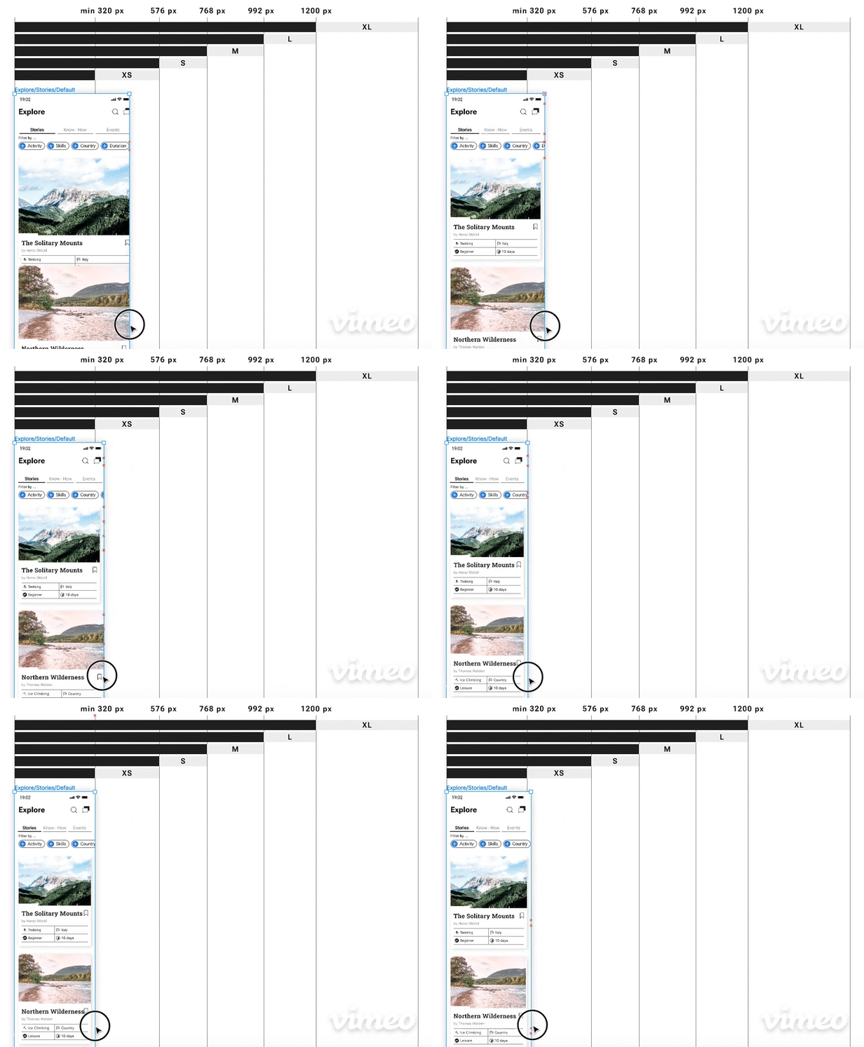
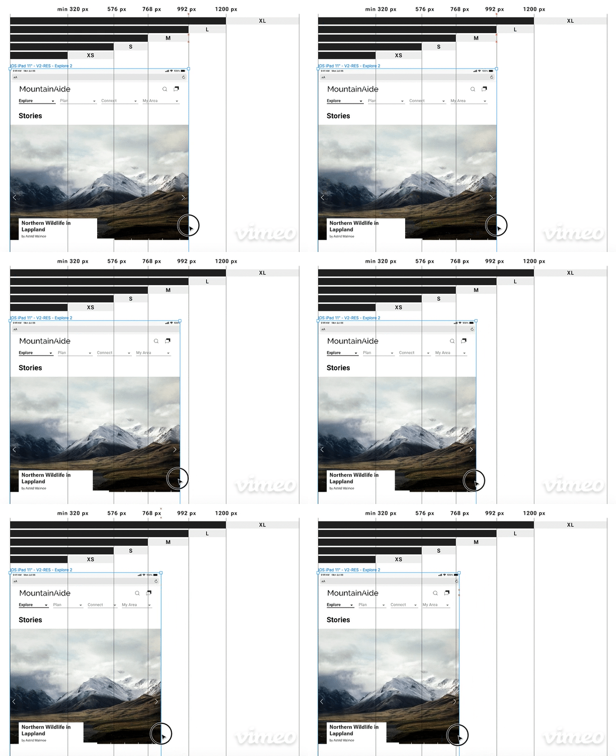
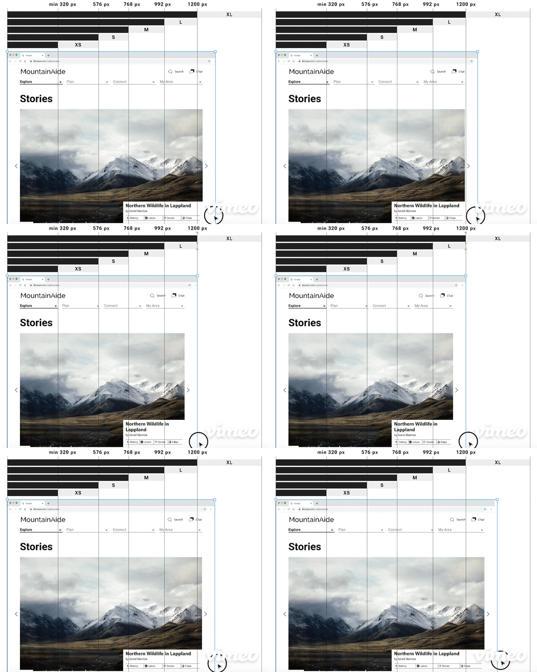
Mobile First Approach
The Mobile Interfaces are one of the smaller real estates. It´s a harder challenge to design for small devices - the user flows need to be thought through even more carefully. It is crucial to focus on the most important content to keep the cognitive overload low. Content needs to be prioritized from the user’s perspective.
As a device increases in size, capability, or both, more features and/or content are progressively introduced.
Responsive Design.

HOW MUCH DOES THE PROTOTYPE MEET THE USERS NEEDS?
Usability Testing
-
Just 5 usability tests will surface approx. 80% of usability problems.
-
Learnability
Efficiency: Testing satisfaction of the app´s performance.
Task Solving Friction Point Definition
Error Rate
Receiving qualitative user feedback for future design improvements.
Process & Methods
-
Planning the Test.
Making a test plan and writing a test script, to be well prepared. Defining the goals, methodoloy and tools.
-
Conducting the Test.
Recruiting participants who match the defined persona profiles will be crucial for an effective testing session. But basic functionality is testable with anyone.
The Test Script guides through the test session. Starting with instructions, followed by questions about general demographic data, background questions, and scenario tasks. Asking the participants to think aloud about their feelings with the product.
-
Analysing Test Results.
Sorting methodically the testing results by using affinity mapping. This is a good framework for isolating and extracting information quickly into top-level categories*:
• Observations
• Positive Quotes
• Negative Quotes
• Errors
*Grouping information by similarity into a single note is allowed.
-
Evaluating Test Results.
Organizing information in a visual way, to recognize the errors by severity. During 6 usability test sessions, 60 observations in total (excluding positive Quotes) were extracted:
• 14 errors
• 26 observations
• 20 negative quotes
All errors were rated on a scale from 0 to 4:
0= It´s not a usability problem
1 = Cosmetic problem only
2 = Minor usability problem
3 = Major usability problem
4 = Usability catastrophe
Prioritizing the errors by multiplying the impact score (Jacob Nielsen´s rating scale) with the factor of the frequency (number lower 1).
Iterating at short intervals on wireframes and prototypes, by gradually integrating feedback from all kinds of stakeholders, will avoid errors at an early stage.
By correcting these errors, I will improve usability enormously.
Deliver Phase

HOW HAS THE PRODUCT TO
LOOK & FEEL LIKE TO ATTRACT
THE TARGETED AUDIENCE?
Refinement
-
Emotional touch
Developing its own personality
Process & Methods
-
Gestalt Principles.
Gestalt Properties
Gestalt Laws of Grouping
Principles of Design -
Native Platforms.
Following the Guidelines and Recommendations of Material.io
-
Design Language System
Brand Color
Icons - Minimalistic Shapes
Typography
Imagery
UI Elements
Copy Language Guidelines
Animations
#202020 Text
#FFFFFF Background
#1F50FB Primary Color

Special cheers to all, who participated during my interview and testing sessions.
Without the contribution from all of you, this project would not have become a reality!
All images © Unsplash.com, free to use under the Unsplash License
2022 - Idea - Concept - Design © Christiane Hornemann
